Back
B2B
AGENTIC AI
ENTERPRISE SAAS
PRODUCT DESIGN
Designing Dweep: an AI-native partner scouting
How I designed an agentic, conversation-first feature that takes a partnership team from raw intent to ready-to-send outreach, all without a single search filter.
ROLE
Solo Product Designer
TEAM
1 Product Designer
3 Full Stack Engineers
1 Product Manager
TIMELINE
1 month
TOOLS
Figma, Figma Make, Claude AI

This project is under NDA
Some details have been omitted for confidentiality. A complete walkthrough of the case study can be provided during a call.
//DISCOVERY
Partnership teams were drowning in noise,
not signals
Sharkdom serves B2B sales and partnerships teams who need to identify, vet, and reach out to potential partners.
The existing flow was form-driven:
Users filled in industry, geography, and deal size fields → got a ranked list → manually researched each result before writing outreach from scratch.
The core friction wasn't the software, it was the cognitive load.
Users knew what they were looking for in words ("NBFC companies actively hiring for partnership roles"), but the UI forced them to translate that into structured filter logic. The result was low match quality, long time-to-action, and heavy reliance on gut feel over data.
Before / Pain points
Filter-first UI required users to pre-structure their intent
No context from the user's own network used in ranking
Match reasoning was vague - why is this partner #1?
Outreach templates were generic, not partner-specific
No risk signals surfaced alongside recommendations
After / Design goals
Natural language as the primary input : no filters required
LinkedIn context enriches every match score passively
Every recommendation explains itself with sourced data
Outreach messages drafted with partner-specific signals
Risk and "why now" signals shown alongside match score
The design challenge
Build a scouting experience that feels like talking to a sharp colleague who knows your company, your goals, and the partner ecosystem.
Not a search engine asking you to fill in boxes.
//SENSE MAKING
Mapping the agentic flow
Early in the process, I mapped what the agent actually does between "user types a prompt" and "outreach sent" — because the UX challenge was making invisible AI work feel legible, not magical. Users needed to feel informed and in control at every step, not passengers in a black box.
01
Intent
Natural language query entered
02
Parse
Agent reads constraints, extracts signals
03
Clarify
Structured questions to sharpen match
04
Rank
Partners scored on revenue + fit + risk
05
Compare
Side-by-side trade-off view
06
Reach out
Personalised outreach, ready to send
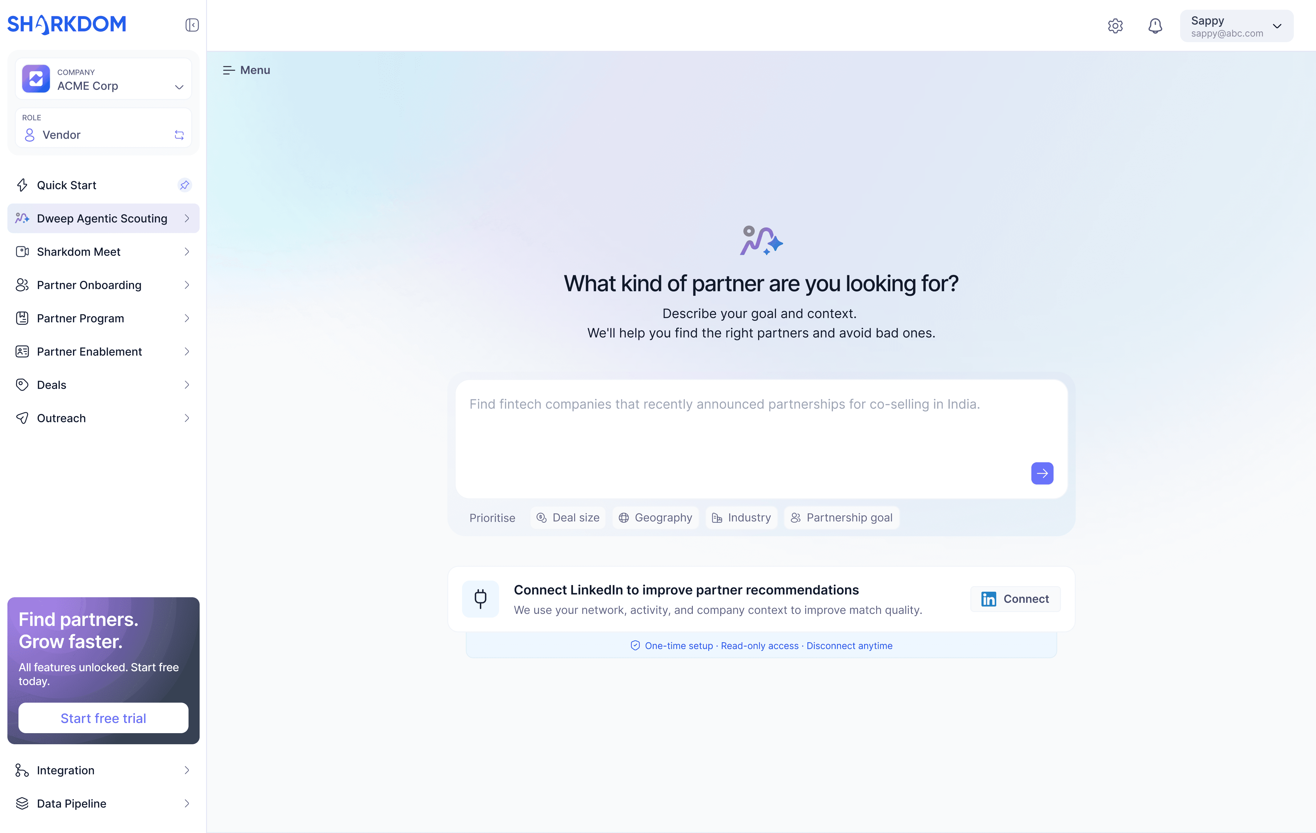
Dweep home state with natural language prompt input and
LinkedIn connect callout
Quick-filter chips (Deal size, Geography, Industry, Partnership goal) let users with a structured intent skip the prompt entirely.
Agent parsing state showing animated status line
Rather than a generic spinner, the agent surfaces its current reasoning step - it signals that something intelligent is happening, not just a database query.

Clarifying questions UI with chip-select options for goal, deal size, and market
Before surfacing results, the agent asks three focused questions using chip selects. Early versions used a filter panel here; testing showed it broke the conversational register entirely.
//DESIGN DECISIONS
The calls that shaped the experience
Several interaction decisions were non-obvious and required explicit trade-off reasoning.
These were the most consequential ones.
Decision 01
Show the agent's work, not just its output
We surfaced the AI's reasoning step at each loading state rather than hiding behind a spinner. Users reported feeling more confident in results when they understood why the agent paused.
Decision 02
Clarifying questions as conversation, not a form
Early versions had a multi-field filter panel appear after the prompt. Testing showed users felt trapped between two interaction paradigms. Chip-selects embedded in the chat stream solved this without sacrificing precision.
Decision 03
Risk signals at the same hierarchy as match score
Match percentage alone created false confidence. Pairing each match with its primary risk ("Limited APAC presence") in equal visual weight helped users make better decisions rather than defaulting to the top result.
Decision 04
Explainable revenue estimates with confidence levels
Revenue influenced ($180k–$240k) could feel like magic numbers. Attaching "High confidence / Estimated using partner customer base size and historical co-sell outcomes" turned a claim into evidence.

Partner results list with match score, revenue range,
and risk signal per card
Each partner card lets users go deeper without cluttering the list view.

Detailed reasoning view with metric explainability, match breakdown, data sources, and risk constraints
The deepest level of transparency in the flow, ensuring the recommendation is genuinely evaluable, not just a number to trust blindly.
//ACTION
From insight to outreach in one flow
The final stage closes the loop: from a shortlisted partner to a ready-to-send, personalised outreach message. The layout is deliberately split — personnel on the left, draft message on the right so the user can evaluate both the who and the what simultaneously before committing.
Personnel are grouped as "Shortlisted" and "Other relevant," giving the user a clear recommended action while preserving optionality.
The draft is framed as editable output, not a finished product. Send channel options (email vs. LinkedIn) keep the user in control of the final mile.

Outreach screen for single partner with personnel list
and draft message
The layout is deliberately split so the user can evaluate both the who and the what simultaneously before committing.
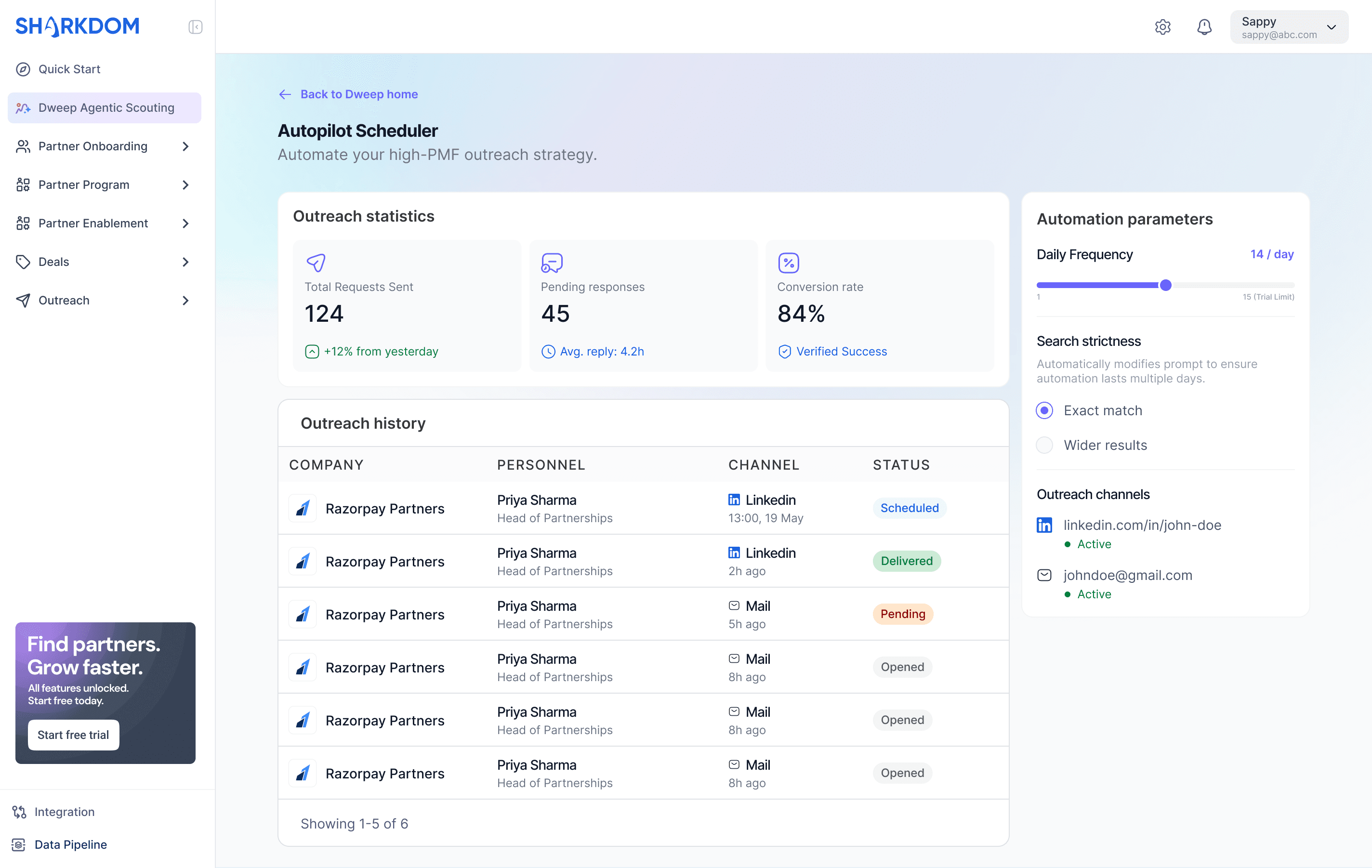
Track and optimise every outreach touchpoint
Real-time view of outreach performance, helping users monitor message volume, response activity, and conversion outcomes in one place.
//OUTCOMES